Well, y'all should have known that me saying nice things about Iboglix couldn't last without a rip in the space time continuum occurring.
And so it came to pass.
Now, I'll confess that I got sick of waiting for the .pdf of the installation guide to show up, and trying to read sequentially through a web site is not my thing, so I missed this bit:
Upgrading to Cognos TM1® 10.1 from version 9.0.x, 9.1.x, or 9.5.x requires a full manual uninstall, and then a full installation of 10.1.
Silly me, thinking that the install package might take care of that the way many other apps do. So I'm not going to hold Iboglix to account for anything stemming from that one, though I'll mention in passing that Perspectives doesn't appear to care for having both versions installed. When I unloaded the 9.5.2 add-in and loaded the 10.1 one (which is a different location, of course, since we now have to brand the path with the IBM name) it bitched about not being able to find a .dll file. I was able to fire up Architect, though, but we're getting ahead of ourselves. I installed it on a 32 bit Win 7 Ultimate Core i3 notebook under an admin account but didn't set the install package to run as Administrator.
I'm not crazy about the new install package. Yes, the old one was a train wreck when it came to trying to install multiple databases (with the path in particular popping back to the default one unless you selected the order of the controls just so), but at least you had control over it. In this one, you don't seem to (unless I missed something) so the sample databases, once again, go in a sub-folder under the Program Files path. Now as I learnt from bitter experience the Vista and onward generation of Windows
does not like data files being mixed with application files (something that purists claim is long overdue) so although I've not been able to test this yet I'm laying odds that I'll have the same happy experiences there unless I move the databases elsewhere.
But other than that it ran pretty smoothly. I installed the whole smash, and it took about 26 minutes all up. I had the same experience as Steve with item 167; whatever it is it took the bulk of the time though mine was 167 out of... 288 I think it was. The end dialog reported that the Configuration Tool completed with warnings and errors but there was nothing in the log about what those might have been.
As I mentioned, I couldn't get Perspectives up but that's probably down to the issue of both versions being installed. The Configuration Manager allowed me to launch one of the sample databases though I had to tell it to ignore the configuration changes (whatever it thinks those were) otherwise it would take forever to generate some encryption; I need to read up on what that's about.
The first thing that I noticed was that the 7 separate non-searchable help files are still on the Help menu despite this being griped about frequently and by many, so the "Muppet Of The Month" award is still in safe hands.
But Steve Vincent,
HOW could you have possibly thought that the wonderful GUI design team would leave us without a way of telling whether a chore is active?? Why, if you put your glasses on... no, not
those glasses, the ones that I sent you for Christmas to work with the TI editor (which is unchanged, by the way); yes, that's right, the ones from the Hubble Telescope Optometry Company, and look way, way down in the bottom right corner. When a chore is inactive, there's a little square with a diagonal bar through it. Well, no, maybe you can't see it but if you do a screen dump, paste it into PhotoShop and pump that sucker up to 300% magnification, then it'll be quite clear. I make it 7 pixels by 7 pixels. On a 1200 * 800 notebook screen. You do the maths and work out the clarity on that. This would seem to fail "Screen Cues 101". The old system and its colour coding system took only a glance, it was immediately obvious whether it was stop or go, on and off. If you have to look, really look at something and then work it out, that is A Design
Fail.
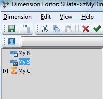
But it gets even worse. Look at the icons for elements in subset editor. Yes, the consolidations are now a chunky orange sigma to help them stand out. I have no issue with this. But the N and S are no more. Instead, they've been replaced by a blue horizontal bar (oh, but a blue horizontal bar with a kinda-sorta
gradient fill, don'cha know, which makes them all new wave and edgy and Web 2.5 and stuff to the extent that you can see it at normal resolution.) Underneath the bar is a microdot sized pictogram which seemed to be slightly longer for the S elements than the N ones. Again, copy it to PhotoShop, pump the h3ll out of the magnification, and the mystery is revealed; the thing under the N elements is a hash mark (sometimes incorrectly called a pound sign (#)), and the one under the string elements is a teeny, tiny a and b. To the extent that you can draw letters at that scale, that is.
So once again, real world, front line usability loses out to... oh, I don't {expletive deleted} know, somebody's idea of style or something? Honestly this kind of absolutely
absurd design, with no regard for function and barely any for form, has just left me exasperated beyond the speaking of it.
I do not expect that to be the end of the fun, though.
I'm hoping that I'll have further positive things to say but it seems to be 1 step forward, 5 steps back.
But you never know, maybe replication works now. If not in this universe, maybe in a parallel one.
Edit: For those who have yet to have the pleasure of meeting 10.1, the new element icons are shown below. Tell me this isn't some bad joke.
- Elements.jpg (14.95 KiB) Viewed 62349 times