Page 1 of 1
A Brief UI/UX Rant
Posted: Mon Dec 01, 2014 10:43 pm
by mattgoff
My migration from TM1 9.5.1 has 10.2.2.1 has largely gone well and there are a number of great improvements (MTQ being a big one), but I just can't get over the HUGE step backwards in UI/UX. It's always been somewhat bad, but I literally cannot think of a worse design. I guess maybe if they made the buttons smaller so you accidentally clicked the wrong one periodically. That would be worse. Or maybe if they only made a Kanji version.
I mean, they have 16x16 pixels and the full color palate to use, but instead they're nearly pixel-identical and have only subtle color differences. WTF Cognos? I guess I'm supposed to know that light blue is a and dark blue is z too.
Luckily I've been using TM1 for over eight years now so at least I'm OK since I remember the button locations and that slice is on the left. God help me when they decide to arbitrarily rearrange them....
<deep breath>
</rant>
Matt
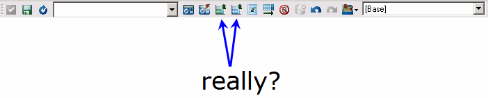
- 1.gif (6.41 KiB) Viewed 7119 times
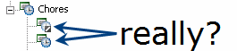
- 2.gif (3.5 KiB) Viewed 7119 times
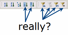
- 3.gif (5.21 KiB) Viewed 7119 times
Re: A Brief UI/UX Rant
Posted: Mon Dec 01, 2014 11:24 pm
by jim wood
Welcome to the push towards Muddler and Cafe. They're trying they're best to make architect look like the poor brother of the litter.
Re: A Brief UI/UX Rant
Posted: Mon Dec 01, 2014 11:27 pm
by blackhawk
Hey Matt!
Yeah, it took me a bit as well to get used to the new icons. Even today, I often find myself hovering (or at least pausing) to confirm I got the right button...
Subset All, expand and expand all buttons are also tricky, especially when your window is narrow and the Expand button drops under Subset All. I frequently hit the wrong button because they look so much the same.
You think this is bad...check out Subset All and Keep on TM1Web.
If they are going to be bad, at least keep them consistent.

Re: A Brief UI/UX Rant
Posted: Mon Dec 01, 2014 11:34 pm
by Alan Kirk
jim wood wrote:Welcome to the push towards Muddler and Cafe. They're trying they're best to make architect look like the poor brother of the litter.
Nuh-uh... one of the biggest b*tches that I have about Muddler in general and the appalling excuse for a new TI editor specifically is the use of icons which look almost identical to each other and/or have no obvious or discernible function until you hover over the things and maybe get a tool tip. It's flat out bad UI design by people who probably did a master's thesis on "This shade of blue vs that shade of blue" but who have never used software products in real life. (Except maybe the palette panel in Photoshop, and it may have been better for all of is if they hadn't.)
The change of the element icons in subset editor is one of the most egregious examples of this. Can't have N and S, that's too clear and not "Web 2.0ish" (if the whole "Web 2.0 thing" really is still a thing); no, we need to have "blue bar with a hash sign that you can identify if you pull out a pair of binoculars, or blue bar with an ab symbol that you can identify if you pull out a pair of binoculars".
My concern is therefore not that they''re trying to make Perspectives look like the
poor brother, it's that they're trying to make it look like a
twin brother of the other crud that they're producing, regardless of the cost to usability.
Re: A Brief UI/UX Rant
Posted: Tue Dec 02, 2014 4:28 am
by rmackenzie
There was nothing wrong with the upside down A for the All subset, or the Zorro mask for aliases

Re: A Brief UI/UX Rant
Posted: Tue Dec 02, 2014 1:22 pm
by jduplessis
Agreed. I'm always amazed at how poor the UI is for a product that costs what it does.
Re: A Brief UI/UX Rant
Posted: Tue Dec 02, 2014 1:38 pm
by jim wood
Alan Kirk wrote:jim wood wrote:Welcome to the push towards Muddler and Cafe. They're trying they're best to make architect look like the poor brother of the litter.
Nuh-uh... one of the biggest b*tches that I have about Muddler in general and the appalling excuse for a new TI editor specifically is the use of icons which look almost identical to each other and/or have no obvious or discernible function until you hover over the things and maybe get a tool tip. It's flat out bad UI design by people who probably did a master's thesis on "This shade of blue vs that shade of blue" but who have never used software products in real life. (Except maybe the palette panel in Photoshop, and it may have been better for all of is if they hadn't.)
The change of the element icons in subset editor is one of the most egregious examples of this. Can't have N and S, that's too clear and not "Web 2.0ish" (if the whole "Web 2.0 thing" really is still a thing); no, we need to have "blue bar with a hash sign that you can identify if you pull out a pair of binoculars, or blue bar with an ab symbol that you can identify if you pull out a pair of binoculars".
My concern is therefore not that they''re trying to make Perspectives look like the
poor brother, it's that they're trying to make it look like a
twin brother of the other crud that they're producing, regardless of the cost to usability.
Good point Alan.